

Ground and granulation, hue and saturation
Ground and granulation, hue and saturation
Nerding out on pigment.

During my first maternity leave I started painting with watercolours. It was quicker and more manageable to do at home during nap times. However, it was also a steep learning curve. So different to oils, with nowhere to hide. You can’t scrape back the mistakes so you have to embrace them and it can get very muddy very quickly. I think there’s a lot I learned from it that transferred back into oil painting and weaving, so in this second perinatal period I got a little consumed again with water based pigments, papers and brushes.
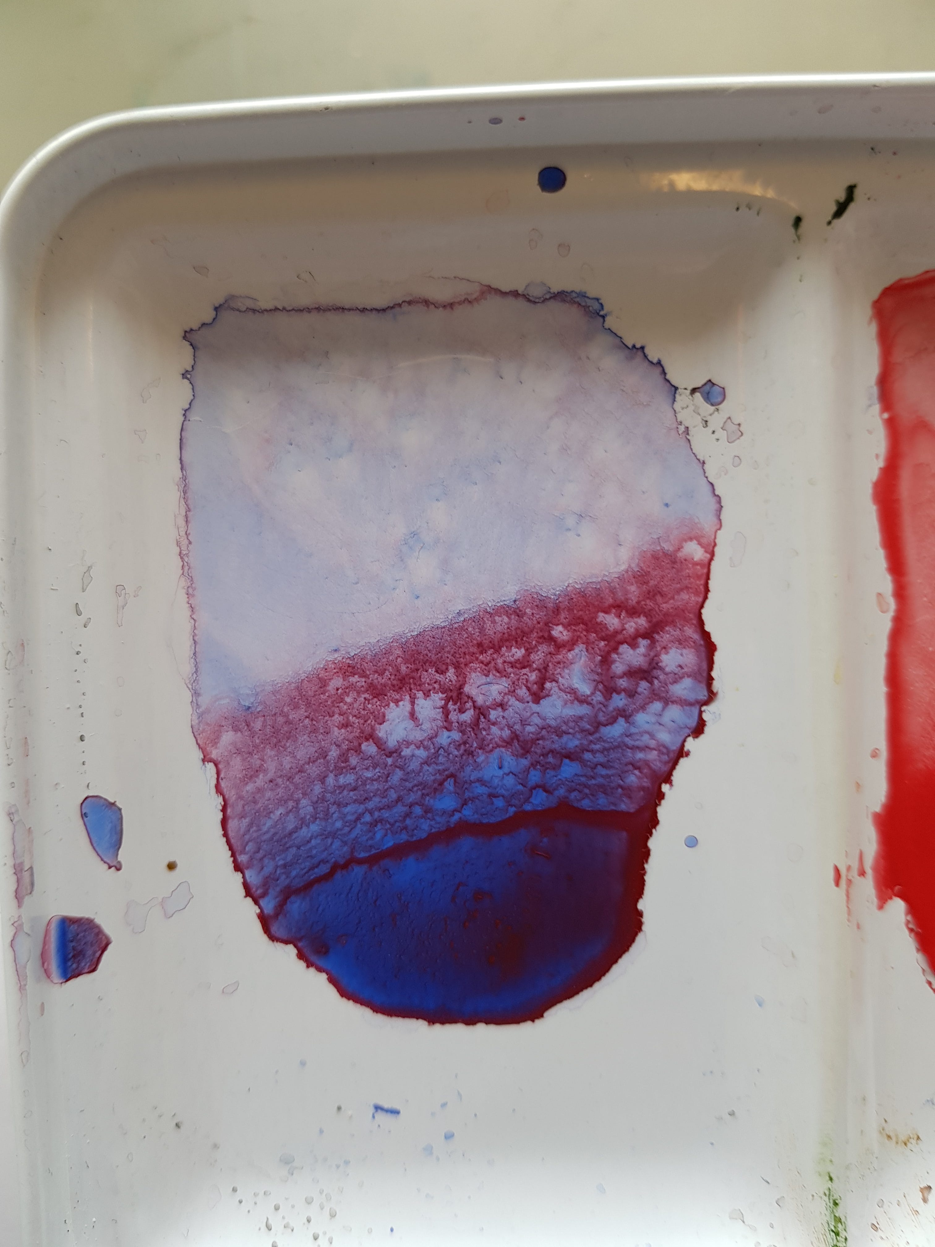
Granulation is something specific to watercolour. It’s basically when heavy pigments settle into clumps and create texture. It’s part of that learning curve I mentioned. Like… these paints have a life of their own, why are they DOING this? Now I understand that a bit better. I do enjoy texture and unpredictability in my paintings and for that reason I prefer fine grain cold pressed paper - the bumpy stuff - so the pigments get caught. I’ve tried other grounds but I have two I’m sticking with. Arches and Windsor and Newton blocks are my favourite.
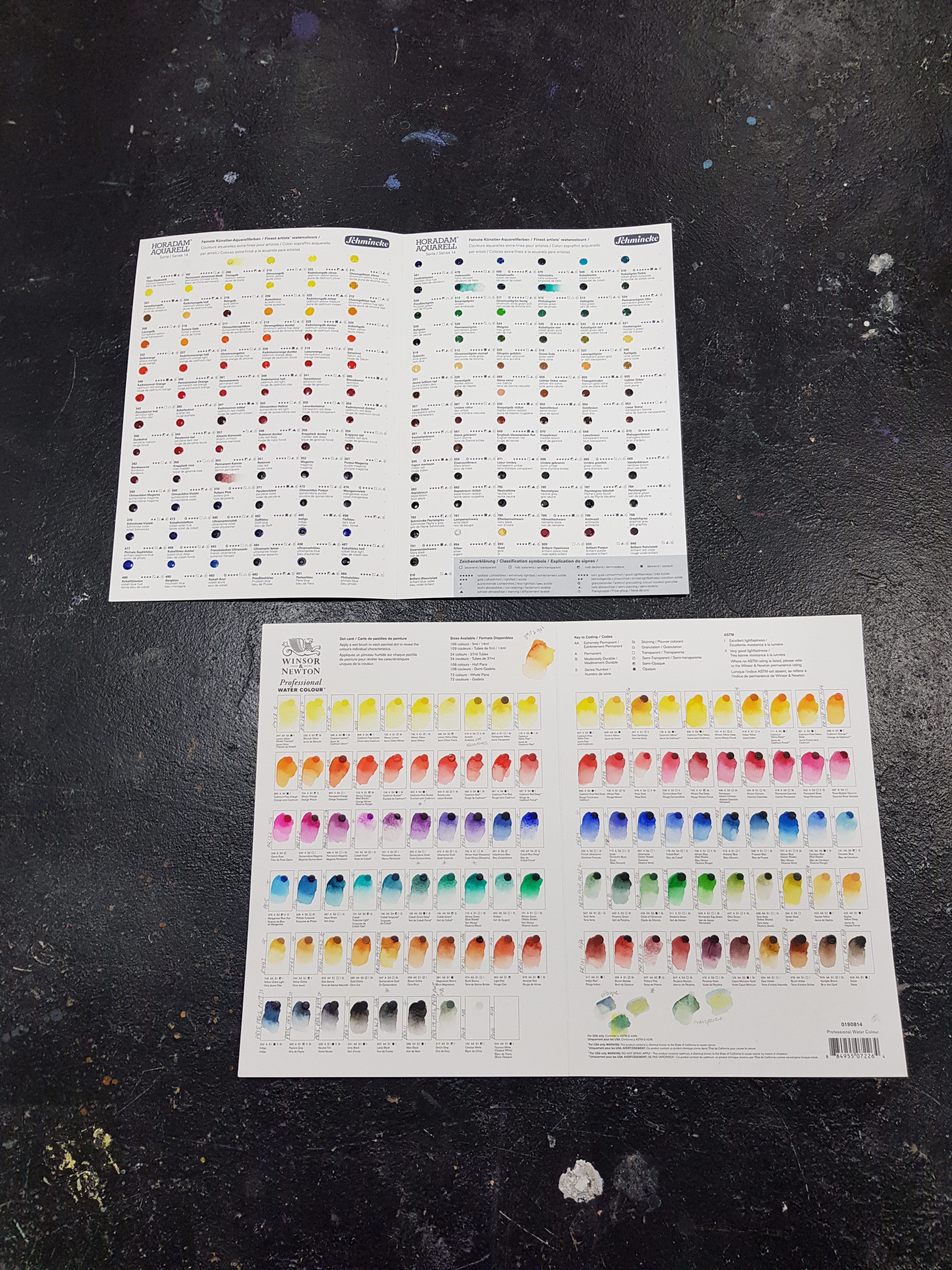
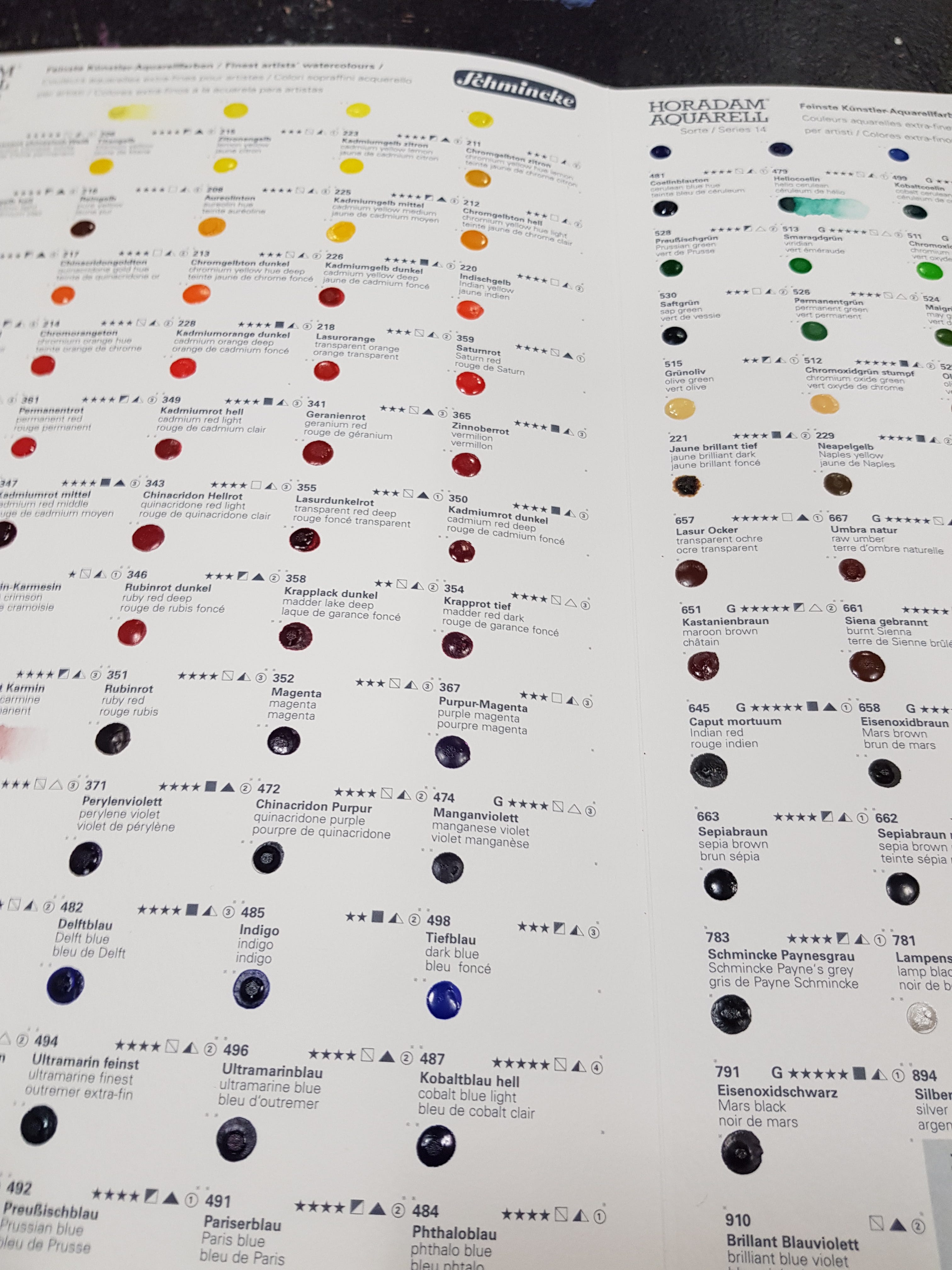
With oils I have a number of go-to colours, and I wanted to narrow down my palette with watercolours and stock up on good artist quality colours. Jackson’s have a wonderful blog with stories about different pigments and their histories which I’m addicted to (particularly the posts by Evie Hatch - link below). I got a bit obsessed with single colour pigments and their colour indexes, going through all my paints and noting their different pigment numbers and their properties.
The first thing I did after reading up on thousand of blogs and articles was order two of these dot cards - the Windsor and Newton and Schmincke ones. It’s a way of trying out every single pigment in the range (my GOD - I find this SO satisfying).
PB29 (Ultramarine Blue and French Ultramarine)
I want to take a deep dive (pun totally intended) into Ultramarine, as I just love that so many of the colours we still use were once made from minerals and gemstones. Ultramarine, originally made from lapis lazuli, cost so much that Renaissance painters would charge separately for it. At times it was more expensive than gold, so it became a status symbol for patrons as well as a colour reserved for the most worthy of subjects (the Virgin Mary in particular). In the 1820s the French government requested the invention of a cheaper alternative to Ultramarine, and a French chemist called Jean-Baptiste Guimet delivered. Understandably this new ‘French Ultramarine’ took over and the more expensive counterpart lost favour. Now both Ultramarine and French Ultramarine refer to different synthetic hues. Daniel Smith still carries a genuine lapis lazuli watercolour in their range but at around £25 for a 15ml tube I have yet to try it out (and to be honest it looks a bit washy? … anyone used it feel free to feed back)


Ultramarines colour index is PB29 (Pigment Blue number 29) but even within that there are loads of different variations leaning more green or purple depending on the brand. If a brand has both, the French Ultramarine tends to pull more warm (purple) and the Ultramarine is cooler (green).
Payne’s Grey
Now let’s look at Payne’s Grey, which I often use instead of black in oil paint. This is a convenience mixture, often of black, blue and crimson pigments. For example, in oil colours Windsor and Newton use Ultramarine Blue (PB29), Slate Grey Black (PBk19), Lamp Black (PBk6), and Red Iron Oxide (PR101). For this reason I tend not to mix it with other colours (except sometimes ultramarine, which is already in it) as it can result in a bit of a dull mud.
The original formula for this paint mixture by William Payne was said to be Prussian blue (PB27), Yellow ochre (PY43) and Crimson (PR83) (blue, yellow and red). Different brands have different mixtures too, so essentially the same watercolour could use all these different combinations of pigment:
Daniel Smith: PBk9 & PB29
Winsor & Newton: PBk6, PB15 & PV19
Holbein: PBk6 PB15 & PR122
Schmincke: PBk7, PB29, PR101
Sennelier: PBk7, PB15 & PV19
(Source: https://www.watercoloraffair.com/paynes-grey/)
On top of this Daniel Smith’s Payne’s grey watercolour is a mix of two granulating colours, leading to a lot of texture. Windsor and Newton, on the other hand, do not use granulating colours so will have entirely different characteristics (and all of this will be up to your own preference).
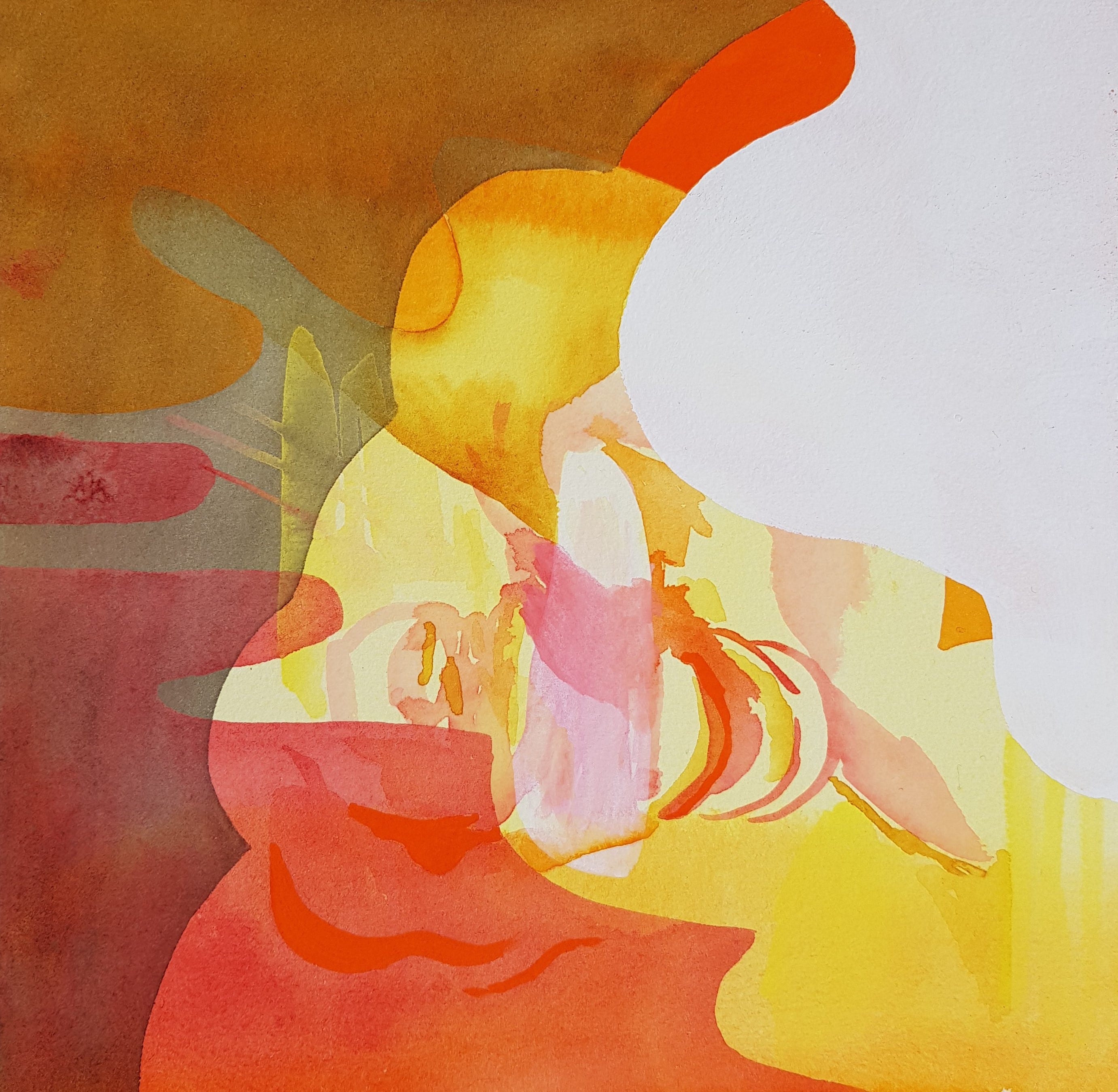
As I write this I’m realising I don’t have any finished work using these colours together, perhaps because lately I’ve been drawn more to the warmer colours. Maybe I’m trying to usher in spring.
I had to take a break from art and writing over the winter. There was a lot of life going on - but I’ll save all that for another post.
Links
Jacksons pigment references (there are loads so I’m just picking two here):
https://www.jacksonsart.com/blog/2023/03/06/the-unexpected-history-of-paynes-grey/
https://www.jacksonsart.com/blog/category/art-technique/pigments/
Books:
so great to see what you’ve been up to and wonderful writing and insights as always. I’m a huge Daniel Smith fan -his paints are like living organisms. I’m going to take a read of Chromascopic -it sounds amazing.